Navegante
A New Digital Mobility Experience in Lisbon
Feb — Mar 2022
My role
User research
User Testing
Team
Pedro Neves
Pedro Lozano
Rita Cabrito

01. The Challenge
The Navegante card, used daily by thousands across the Lisbon Metropolitan Area, still relied heavily on in-person processes—such as queues at kiosks and counters—and outdated interfaces. This caused user frustration, especially at the beginning of each month during peak renewal times.
With the launch of the new brand and a strategy focused on digital transformation, the opportunity arose to create a mobile app that would allow users to purchase, reload, and validate their pass in a simple, contactless way using NFC or QR Code technology.
The Navegante project was created during the User Experience Design Foundations course at EDIT.
Objectives
The Navegante project had three main goals:
- Make the experience more user-centred.
- Expand the user base through an accessible digital experience.
- Drive the brand’s digital transformation with an effective mobile solution.
How might we...
Make the process of buying and renewing a transport pass faster and more intuitive?
Encourage more users to transition from physical to digital solutions?
The Process
02. Research
2.1 Research
We studied the mobility context in the Lisbon Metropolitan Area, reviewed demographic data, observed kiosk usage, and conducted a survey with 23 users aged 19–35.
Most participants preferred using automated machines to reload their passes, but they reported difficulties renewing special passes and facing long queues at physical points of sale.
As part of a contextual inquiry, we observed how users interacted with the automatic kiosks in real environments to better understand their behaviours and points of friction.

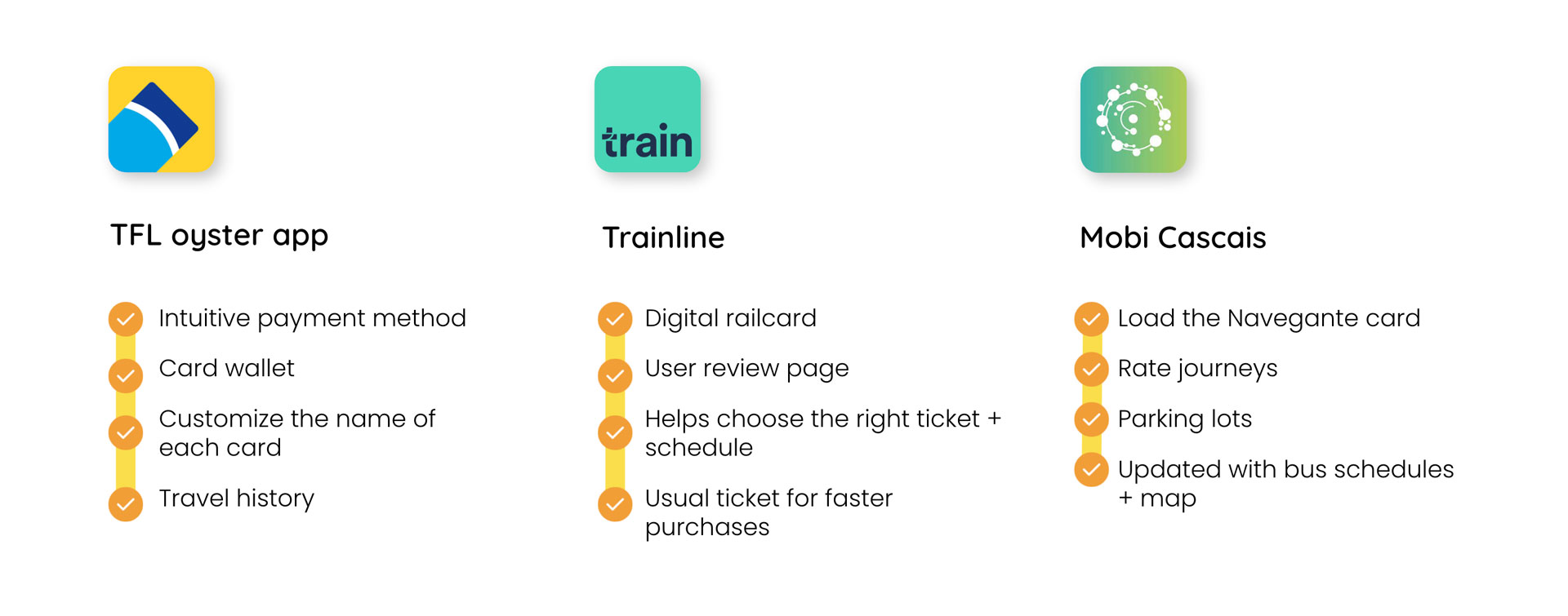
2.2 Market Analysis
We analysed the TFL Oyster, Trainline, and Mobi Cascais apps to identify best practices and limitations. None offered a fully unified, digital solution.
2.3 Stakeholders
We identified the key stakeholders involved:
- AML/TML leadership
- Local governments
- Transport companies
- Users
- Sponsors
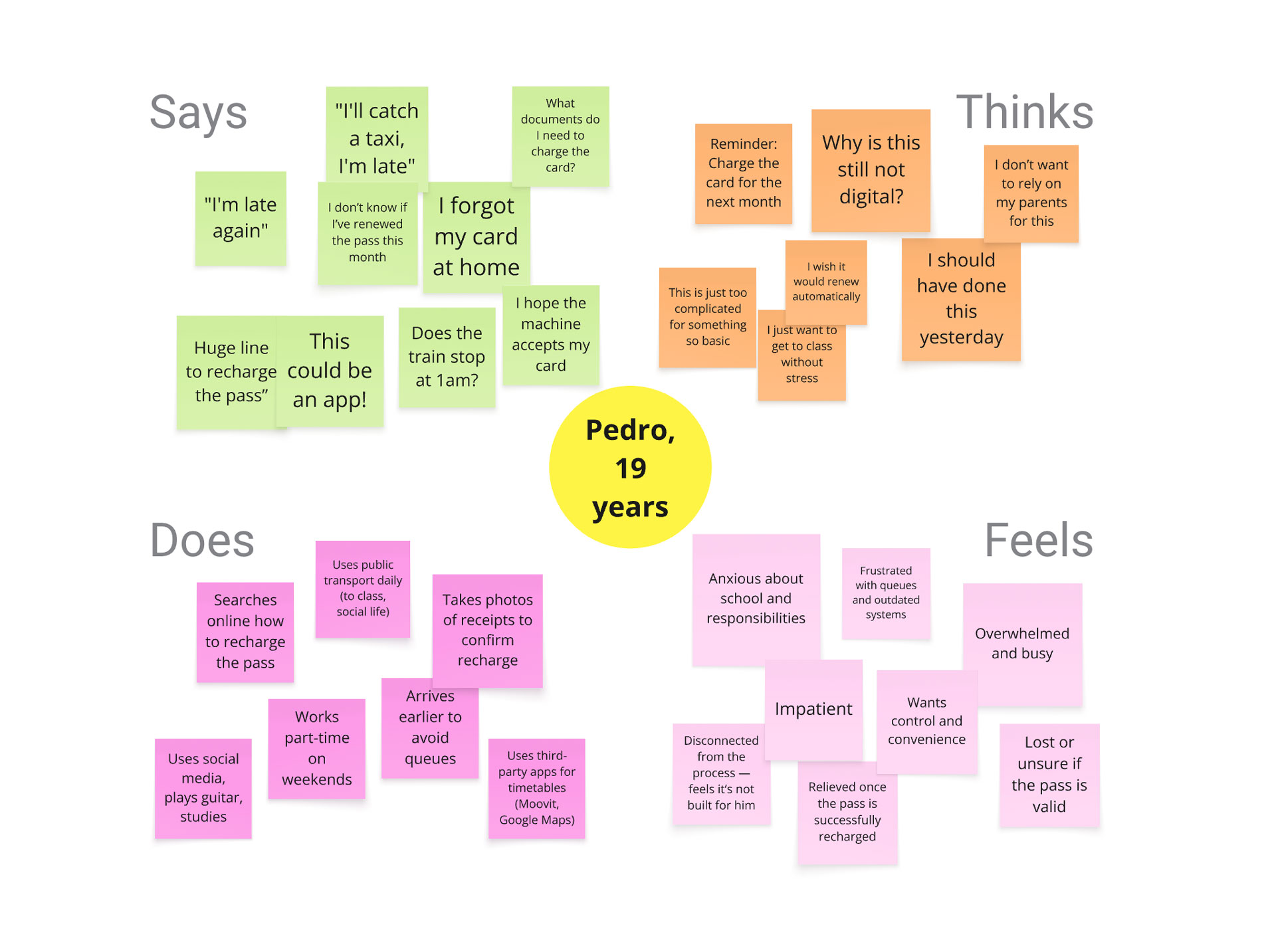
2.4 Persona
We developed a representative persona based on common patterns in user needs, behaviours, and frustrations observed in the research.
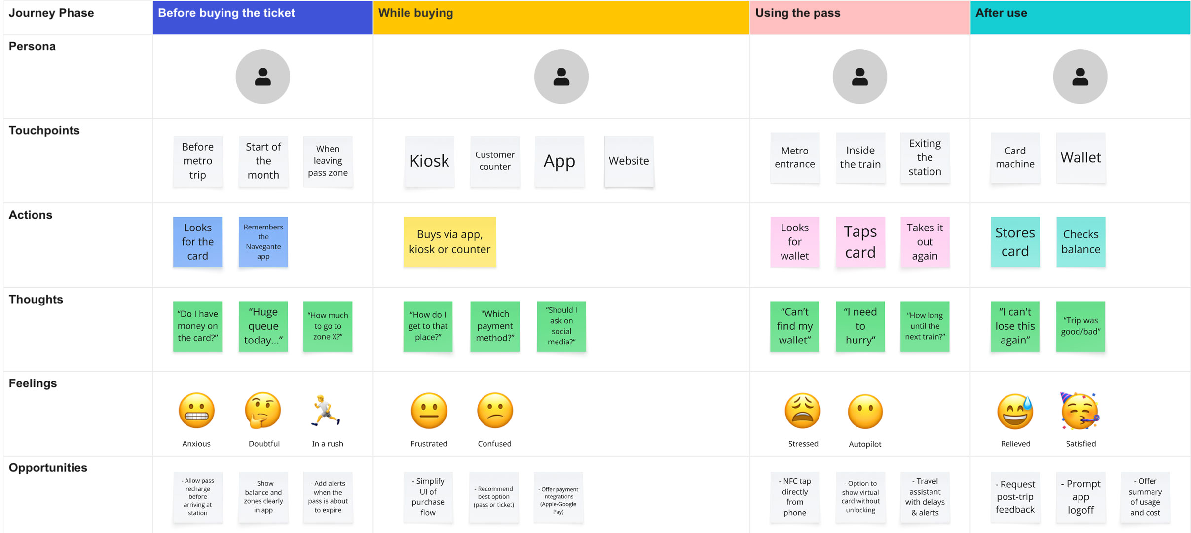
2.5 User Journey Map
To deepen our understanding of Pedro’s experience, we mapped a typical day using public transport — from recharging the pass to completing a trip.
This journey highlighted several key pain points, such as decision fatigue, physical friction (queues), and uncertainty around balance and card status.
Insights from this exercise directly informed the ideation of key features, like digital recharge, smart alerts, and simplified flows.
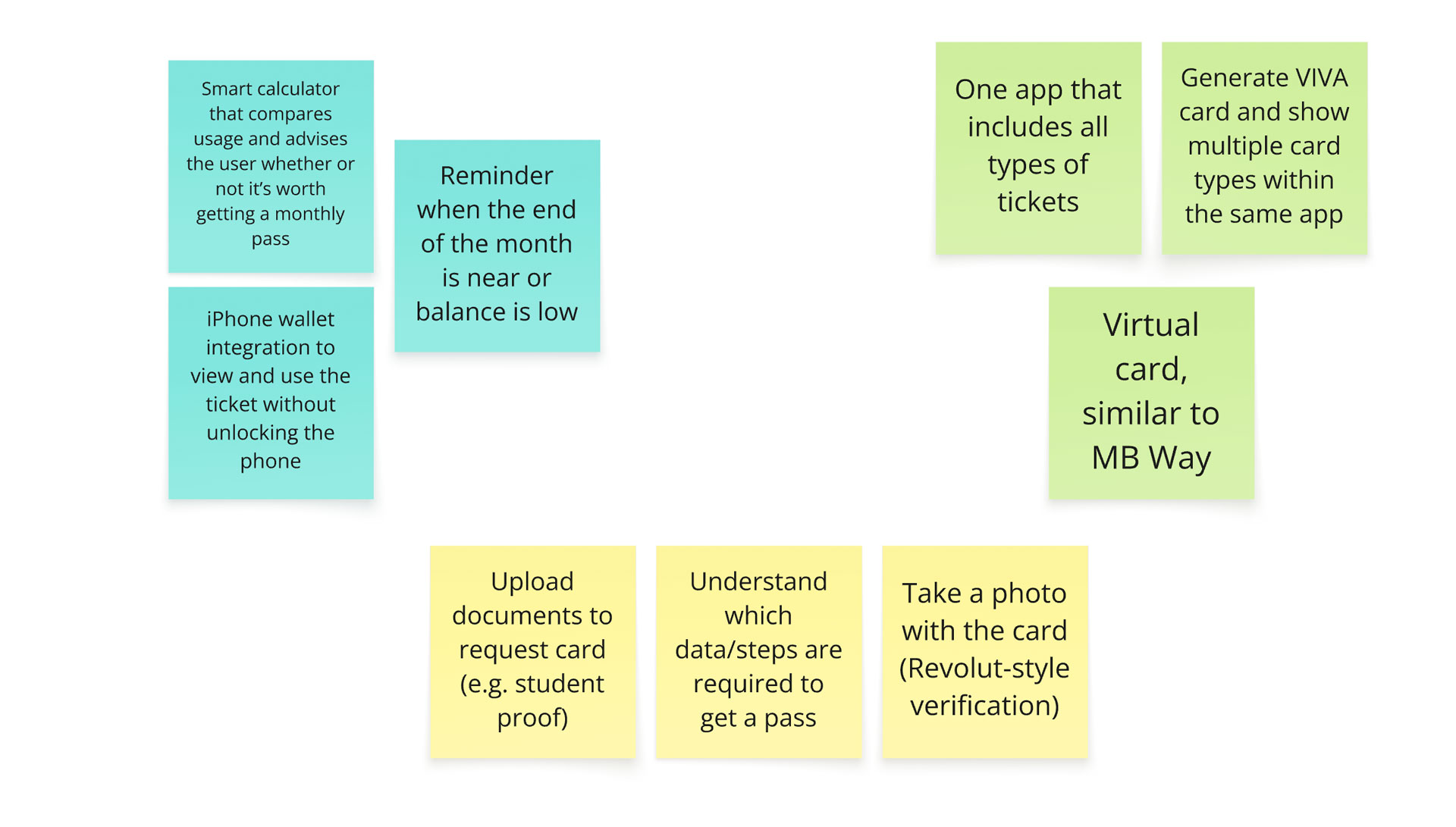
03. Ideation
We translated research insights into early design concepts through quick sketches, flow mapping, and moodboarding. This helped align the team around key features such as card linking, balance visibility, and a simplified purchase experience — always guided by clarity, accessibility, and ease of use.
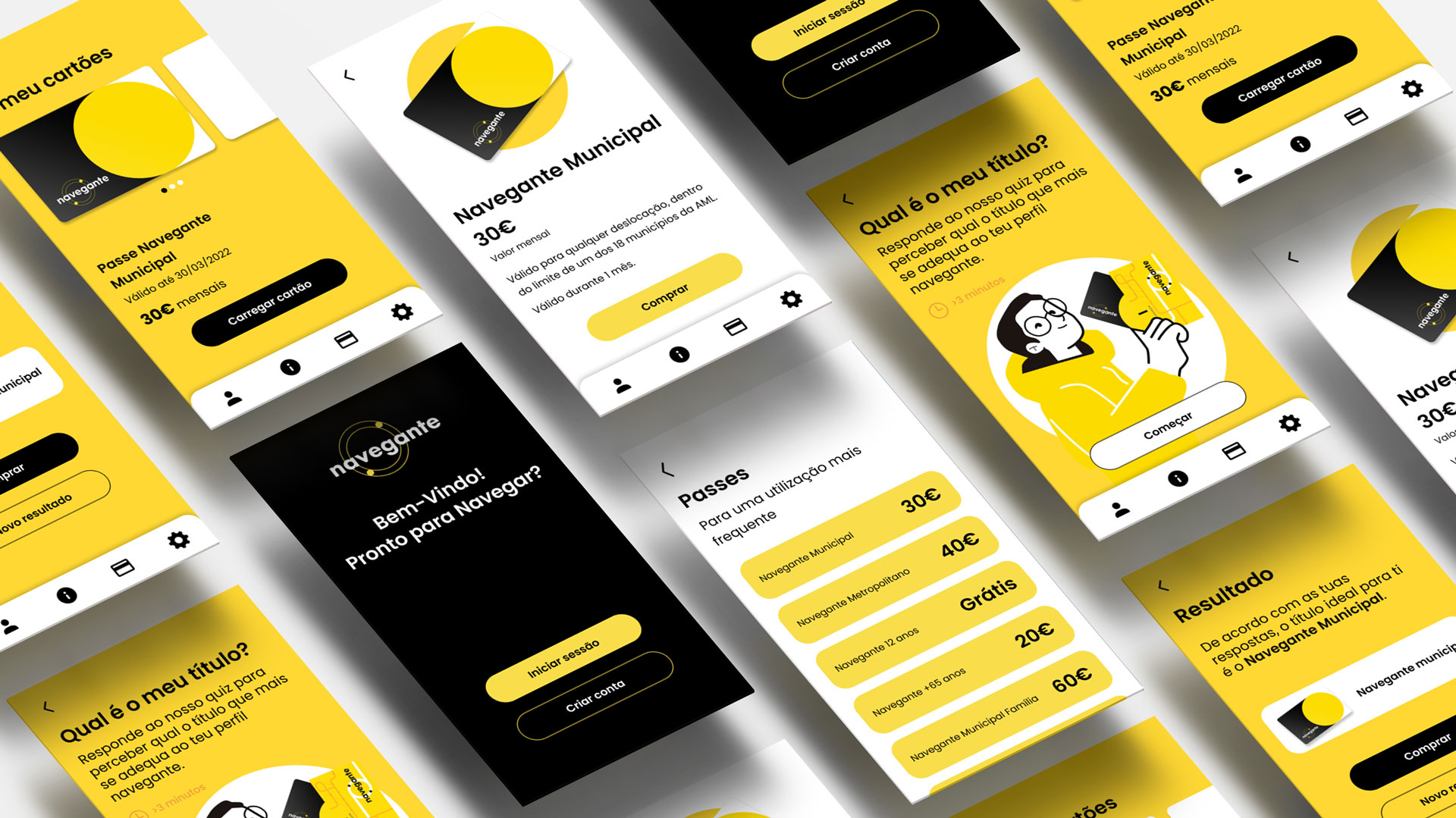
04. The Solution
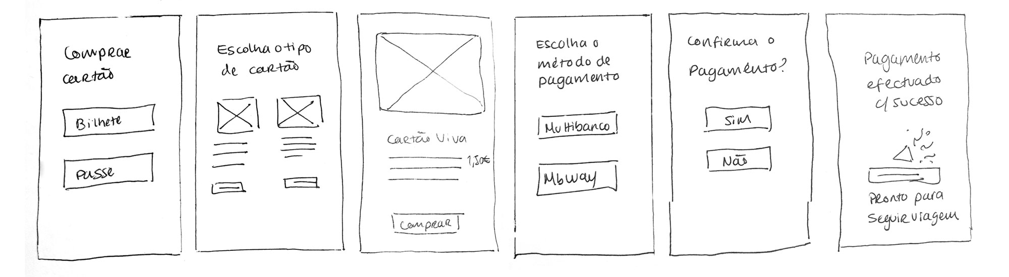
We developed low-fidelity prototypes, which were tested and refined into a high-fidelity version. A comprehensive UI Kit was created to ensure visual consistency and scalability.
4.1 Usability Testing
Usability tests with three users highlighted areas for improvement, including:
- Integration with Apple Wallet
- Subscription and pass expiry alerts
- Redesigned icons for improved clarity

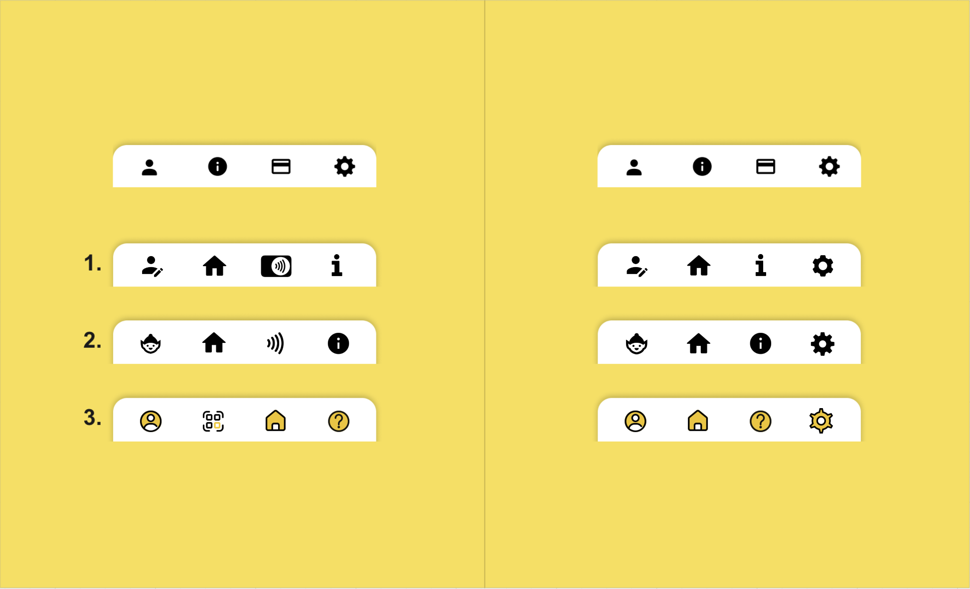
4.2 Design Rationale
Key improvements implemented:
- Redesigned main menu for easier navigation
- Replaced “Learn More” button with “Buy Pass”
- Added option to link an existing physical card
05. Impact and Future
The project helped validate the feasibility of a digital solution for managing Navegante passes. Key areas identified for future development include:
- Multilingual support
- Expanded tab bar for additional features
- User feedback module
- Voice-to-text support and biometric login
06. Conclusion
As a regular user of public transport in Lisbon, this project held special meaning for me. Being involved in every stage reinforced the importance of grounding design decisions in real data and direct observation.
The field research experience showed how the context of use directly impacts the design of digital solutions. The project was graded 20/20, reflecting the rigour and dedication applied at every stage.